You’ve heard the term for years, but do you really know what a landing page is? More importantly, have you implemented any properly?
To many storeowners, a landing page is a “splash” page that spotlights a product. It looks something like this.

Landing page for the Nest Thermostat. From the start, it’s not so clear what this product actually does, or that it’s controllable via smartphone (which is point 5 on the page).
The actual purpose of the landing page, though, is to simplify the process of understanding how a product looks, what it does, how one uses it, and how the consumer benefits from owning one. And all these components should be quickly apparent — that means minimal scrolling on desktop computers and tablets. The goal is to inspire the shopper to take the next step — to navigate to the proper location to buy because he believes the product is beneficial.
Unlike selling-type pages, which focus primarily on purchasing power, the landing page educates the visitor, and instills confidence.
Look at Fitbit’s landing page, below, for the Flex. It covers all the basics — how it looks and fits on the wrist, what colors are available, and what it actually tracks. Since activity trackers are immensely popular today, the way they are showcased directly affects the bottom line.
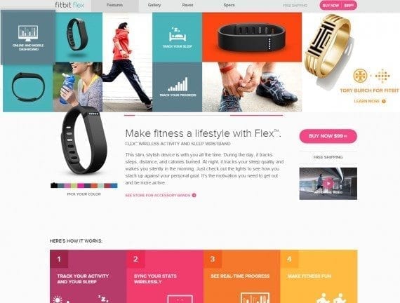
The Flex’ design and features are front and center. The page relies on both text and graphics to get the message across. While a purchase button is present, selling is not the main focus of the page.
KitchenAid takes a different approach when highlighting its stand mixers. The brand is well known, so potential customers are likely more familiar with its products before comparing standing units to other brands. This landing page uses photos, and then highlights three key features: the ability to use attachments, various available beaters, and bowl options. This is all followed by a group of products, all in different colors.
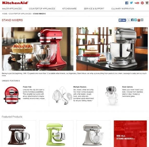
No pricing is displayed, and the primary focus is put on how the products look and their unique features.
Granted, every page of an online catalog is a type of landing page — i.e., a page visitors are sent to from external links and search engines. When we talk about landing pages in general, though, we’re referring to pages that effectively showcase a product or line of products. Typically these are the pages your competitors are spending more money to promote and rank, and push out to their social media channels.
When devising a product’s or line’s landing page, consider what’s most important to your target audience.
Shoppers of activity trackers, for example, look for specific features.
- An ideal fit (clip on, chest strap, or wristband).
- What it actually tracks (steps, heart rate, sleep, stair climbing).
- How the unit stores data and how users can view their progress (via an app or website dashboard).
- How smart it is (does it know if they’re running or walking, or lifting weights?).
- How it looks — since these devices are often worn 24 hours a day, it’s important the design fits the user’s lifestyle.
It is easy to assume visitors have a good understanding about the product before the page loads, but such an assumption is risky and decreases conversions. Short statements, images and video, and bullet points with links to details can be used to get the right message across.
While the Flex landing page above educates the broadest audience, many of Fitbit’s competitors put too much faith in the general public. With the growing trend of fitness for any lifestyle, it’s important to cater to the young, the old, the fitness junkies and, yes, couch potatoes.
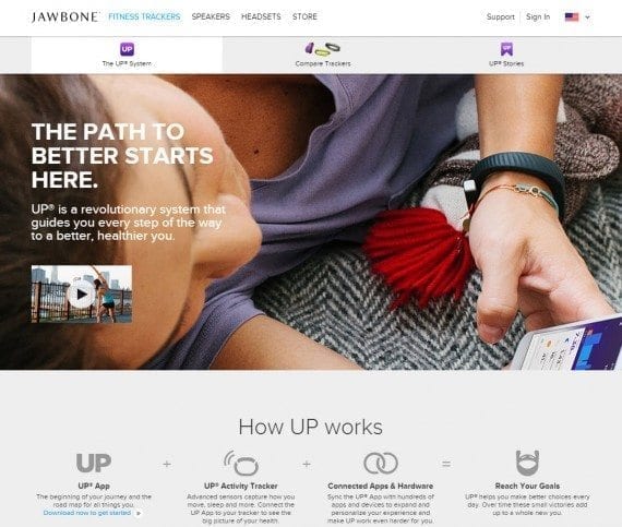
The Jawbone UP’s landing page doesn’t really focus on the device and what it actually does, especially since the photo shows a girl lounging around. This is an example of how photos should always convey the need or desire for the product.
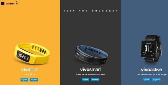
With scarce text, Garmin’s landing page for the vivo line of trackers assumes visitors already know what it is.
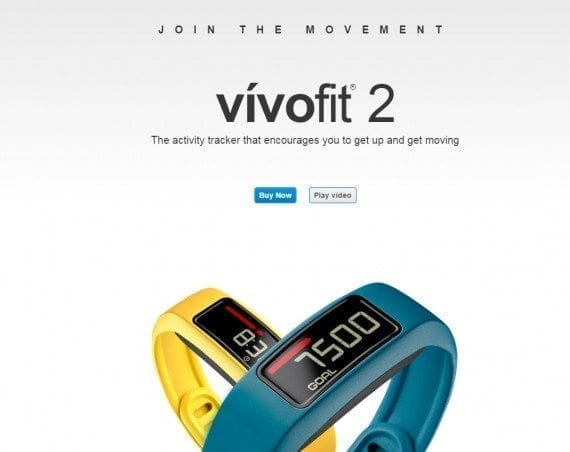
The landing page for the vivofit begs users to just buy it — or, you can watch a video.
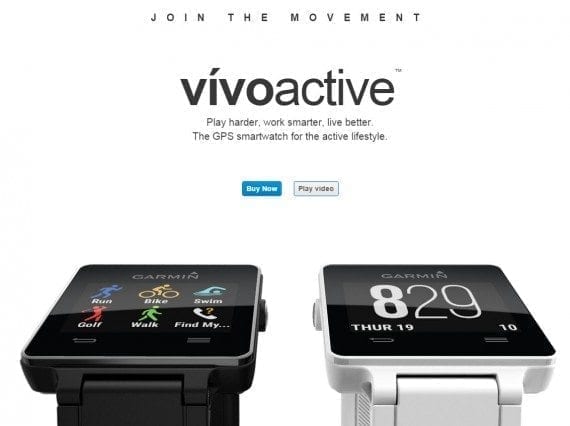
The landing page for vivoactive is clearer. Both the text and graphics convey that this is a smartwatch that tracks activity. However, the focus is still on the sale before the user understands the product.
Aside from feature-driven elements, landing pages should also include:
- Simple site navigation (no cluttered menus);
- Calls to action (buttons that prompt visitors to learn more, browse a category, or buy an item);
- Calls to any sales or coupons;
- Deadlines on any deals or promotions (including coupons);
- Links to reviews, ratings, video, and other content that helps sell;
- For exclusive and timed offers, a sense urgency — typically a countdown clock is used for this feature.
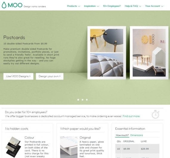
Moo has a simplified landing page for printed postcards. It is easy to see that you can order postcards using stock or custom designs.
A good example of a landing page that educates is the one for Roku’s streaming stick. It conveys — in the simplest terms — that the device is compact, gives access to lots of streaming services, and can even be controlled with a smartphone. Confidence boosters include a 4.2 user rating, and a money-back guarantee. The content on the page is supported by a “why you’ll love” video.

All the key components are here: what it is, how it works, and what other users think.
Unfortunately, the bulk of small business ecommerce sites leave the creation of ideal landing pages to the manufacturers, which, in some cases, are your direct competitors. With a little effort, and some compelling product-in-use shots, though, these points of entry can help increase visibility, sharing, and overall conversions.
Have you created any landing pages for your online store? Let me know, and I’ll run it through the test!